36 DAYS OF TYPE
An Instagram challenge —
I’m not as social (on social media) as I’d like to be because, generally speaking, I’m too busy helping my clients with their social stuff.
But once in a while it’s really important to do something that invigorates the creative within. Especially in a world where we can often get lost in our client project work with the constraints of a commercial world.
For the uninitiated, 36 Days of Type, now in its 7th year, starts in May when word gets put out and creatives from around the world embark on an often perilous, definitely time sucking, but ultimately rewarding journey — to imagine, create and share the weird, the wonderful and maybe even conventional typographic adventures & explorations.
Here are some of my thoughts on my first experience and why I’ll relish doing it all again next year.
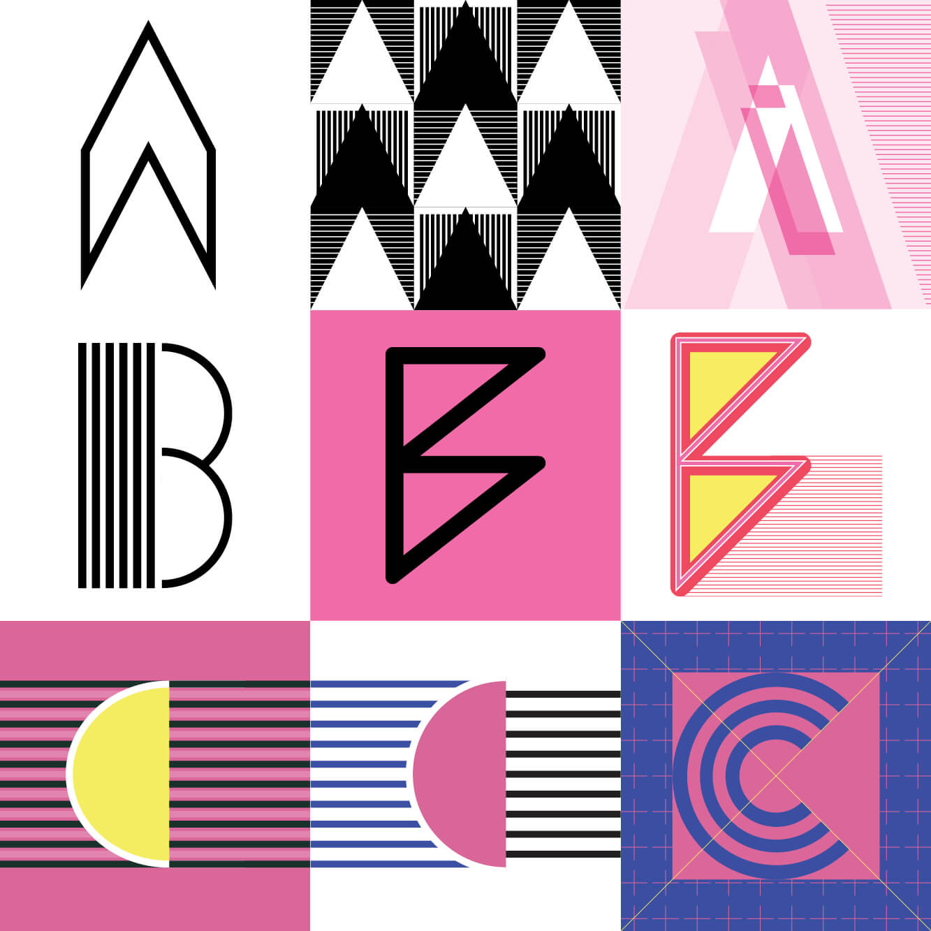
It’s as easy as A, B ,C… or is it?
 eye eye — this was the first letter I submitted 🙂
Let’s start at the beginning.
Well, not quite… You see I missed the start ;( The letter ‘I’ was actually my first submission on day 9. And so what Inspired me? Well as mentioned I generally shy away from these types of challenges as it’s sometimes hard to make time for this kind of, let’s face it, indulgent activity. It then occurred to me that I might adapt work created for clients, repurpose and explore ideas that never saw the light of day. And so ‘I’ was inspired by the identity work I completed for Book Ink Publishing. At some point I’ll share this lovely little identity project but you can see the logo here. (You’ll need to scroll down to see it)
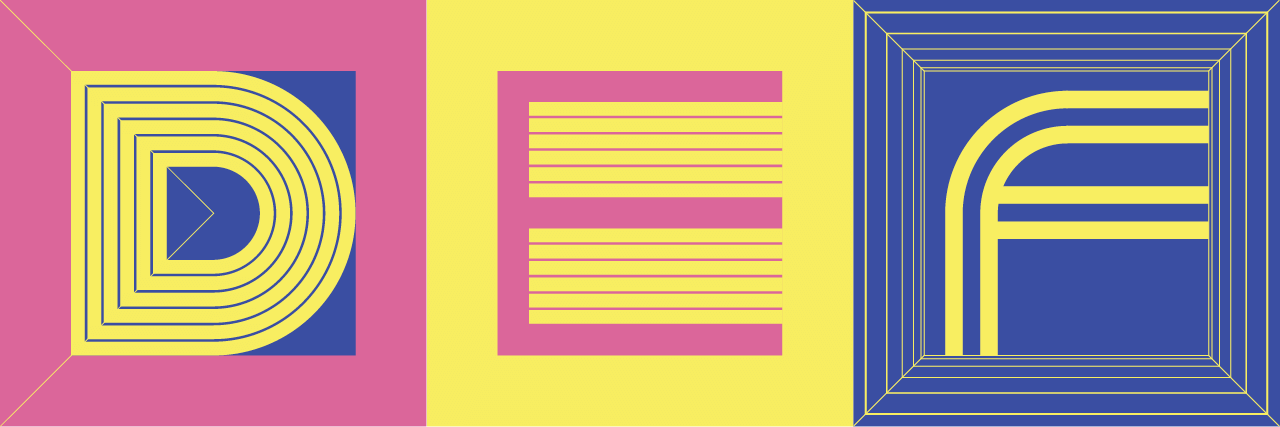
D, E & F followed on from A, B & C… naturally.
I was keen to keep these letterforms simple and work in with the grid that I had established. These letters were created after the challenge had officially finished and the creative direction for my set of letters had emerged and evolved.
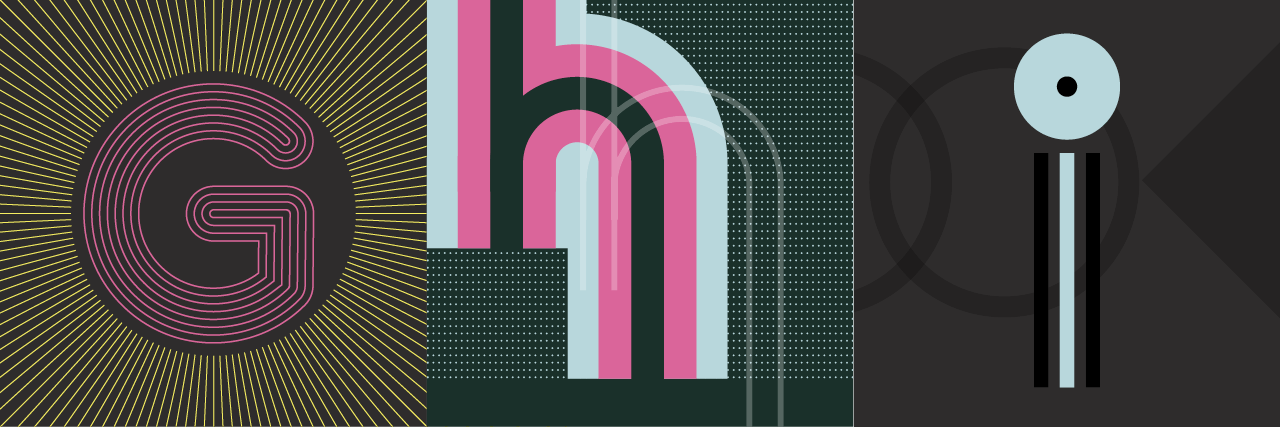
G & H were the last 2 letters completed.
G & H were like visiting old friends.
Both of these letters picked up on themes already visited. The overall look for G was inspired by S — I wanted to play further with the starburst idea. H was designed to link back to the start with ‘I’ and work nicely with J. ‘I’ as mentioned was adapted from client work. I loved the simplify and the ‘all seeing nature’ of the dot. And as this was the first letter I completed this was the catalyst for everything that followed…
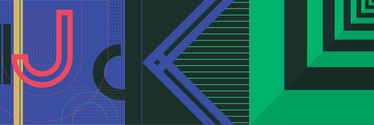
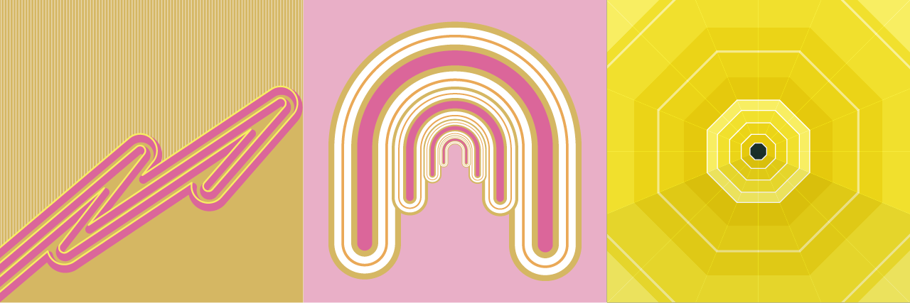
J, K, L, M, N, O
I got very excited.
As a creative once you latch onto an idea it’s a joy to roll with, play with, become best friends. The beauty of this challenge is there are no rules, anything goes — it’s a platform for pure creative expression — even limitless, the inspiration for my letter L………..

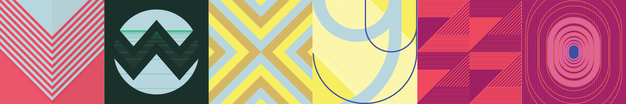
P, Q, R, S, T, U, V, W, X, Y, Z, 0
I couldn’t help myself with P 🙂
Conceptually my letter Q work a treat (I expected you see the Queuing sysyem I installed here 😉 My ‘R’ is adapted from an Identity I created for Ben Rousseau, a clever product & lighting designer now based in LA. S — see below…
T was simple, gain playign with the whole square tile – which I broke down into 3rds here. I love the shape of U and the negative space in the background. V and W are possibley my least favourite examples… V reminds me of a car badge — and W wlist I love the idea of the window intro the world it just isn’t quite right for me… X is a reprise of an old experiment I did with animated gifs and Y was a sunny disposiotion. Z was clever in a repeat print kind-a-way. As for 0 (zero….oooo) yeah, tied to relive the glories of ‘O’ but again I feel this missed the mark.
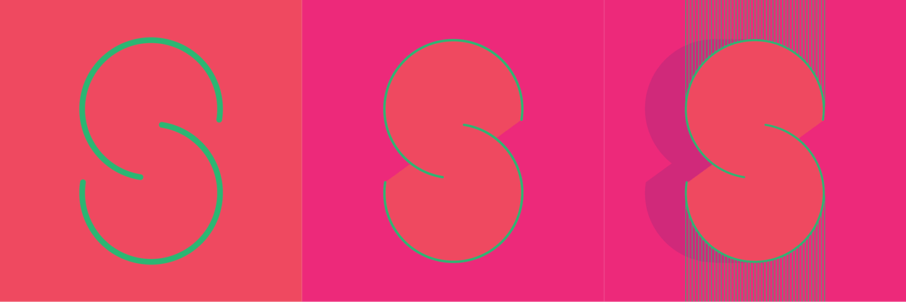
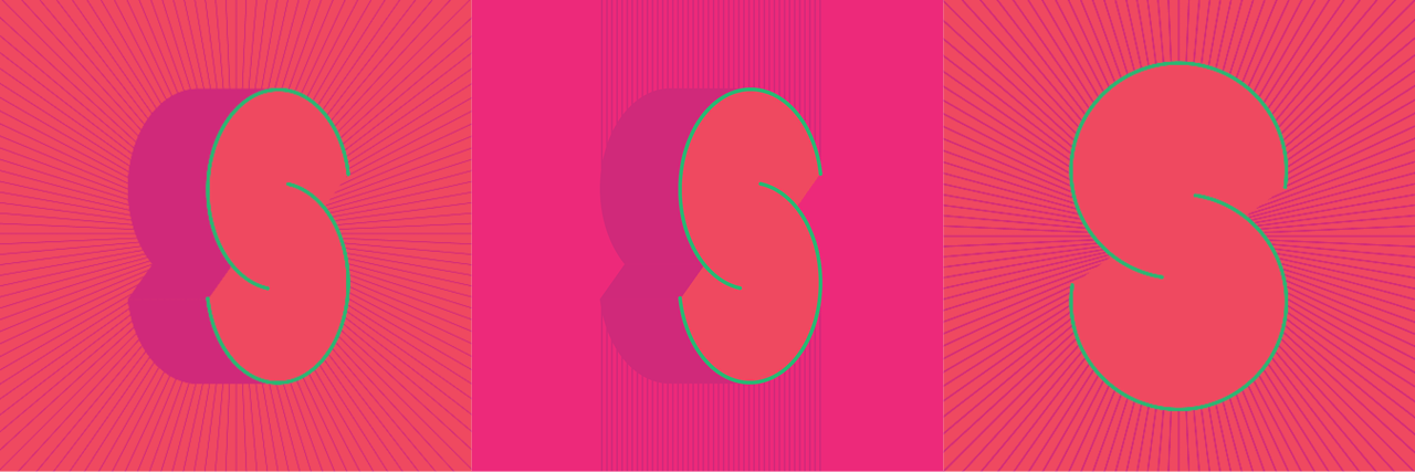
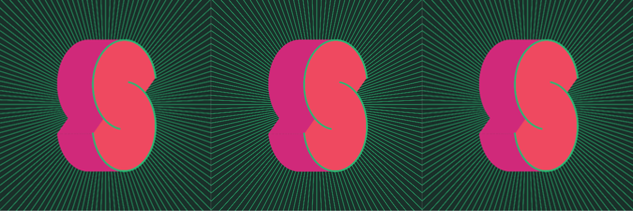
The sweet ‘S’ of success
Exploring variations on a theme. Once you sssstart… I was simple looking for seventies styling inspiration and I actually found it in an old copy of George Orwell’s 1984…
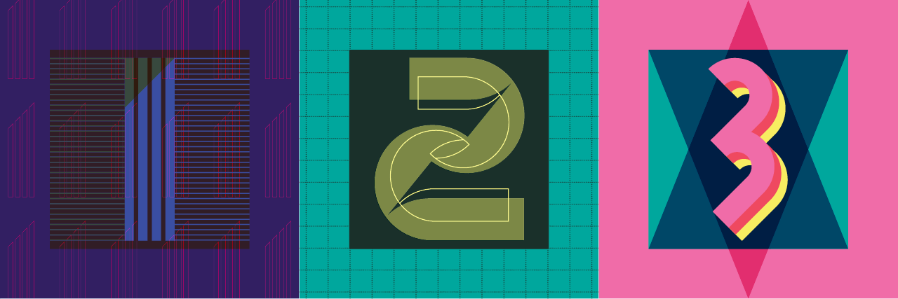
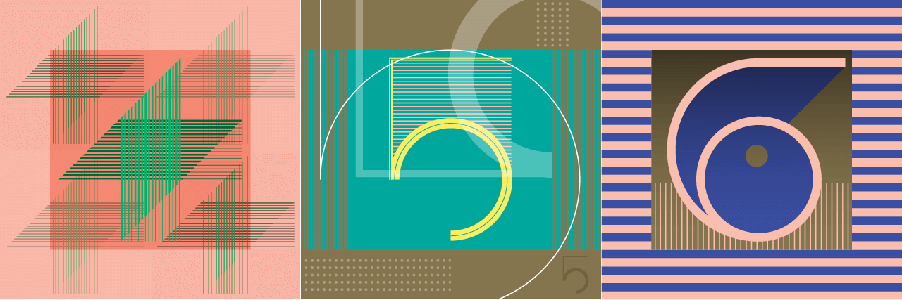
1, 2, 3, 4, 5, 6, 7, 8, 9
And so the numerals came bounding along
For all of the numbers I used a 6 x 6 grid (36 sqaures), placing the number within the central 16 squares… this becomes very apparent by the time we get to number nine. Here’s the inspiration for each number…
#1 Late night TV test card from the future
#2 Fruit label inspired (it was the starting point)
#3 Carnival, display font
#4 Woven textiles
#5 Inspired by the letter J… once created it remined my of the Pixies cover artwork for Doolittle – anyone see that reference? – maybe just the gold or me 😉
#6 Summertime
#7 Babe Rainbow and record sleeves, or maybe plasticine ;0
#8 One of my favourites. We could call it the Melbourne 8, the city of facades (literally cladding) I love the way the tones seem to shift and create movement.
And so we get to #9, a super play on #8 really and striking in its own right, this inspired the letters C, D, E & F… the shape of things to come.
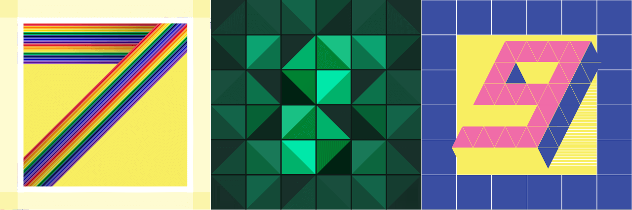
You got my number?