MOSSIMO
Pacific Brands commissioned us to reinvigorate the Mossimo brand, label and packaging applications across all product categories, ensuring we engaged with younger target audiences.
This was no small undertaking and required some extensive research. Aside from reviewing the competitor landscape, we interviewed current and potential customers groups to fully understand how they perceived the Mossimo brand. The findings were revealing and of course fed directly into our creative work — some of which is documented in this detailed case study.
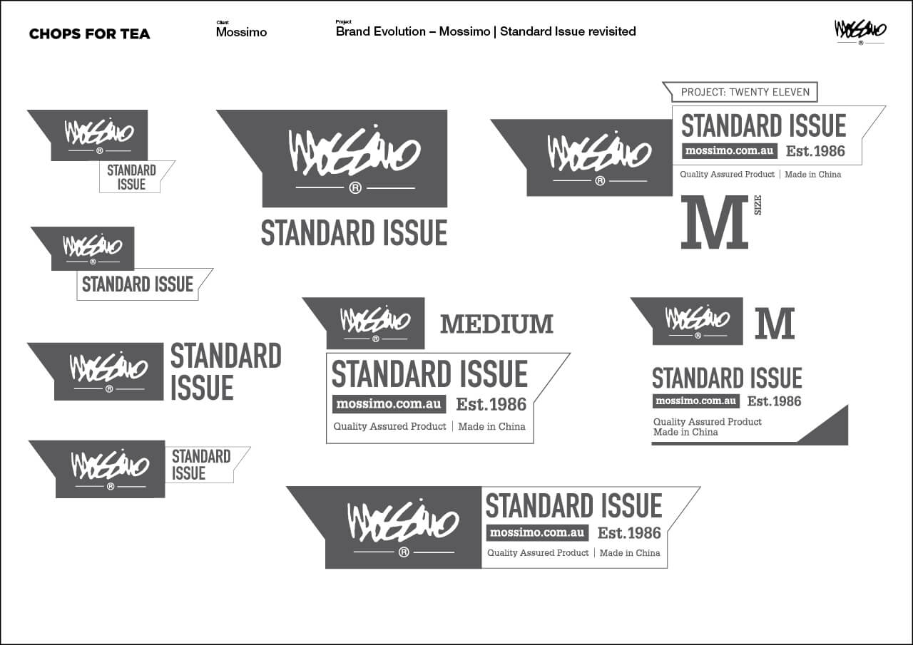
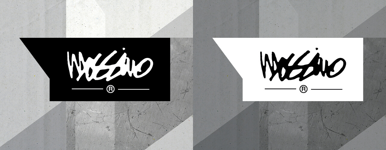
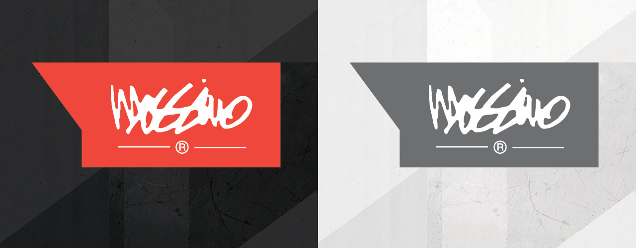
Ultimately, we repositioned Mossimo as the ‘definitive word on street fashion’. We designed a stylised speech bubble in which the cherished Mossimo signature sits.
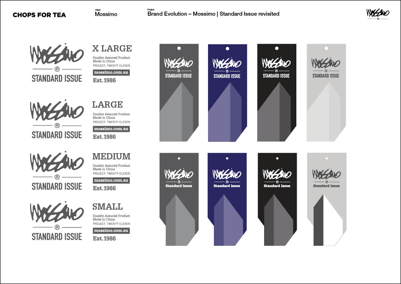
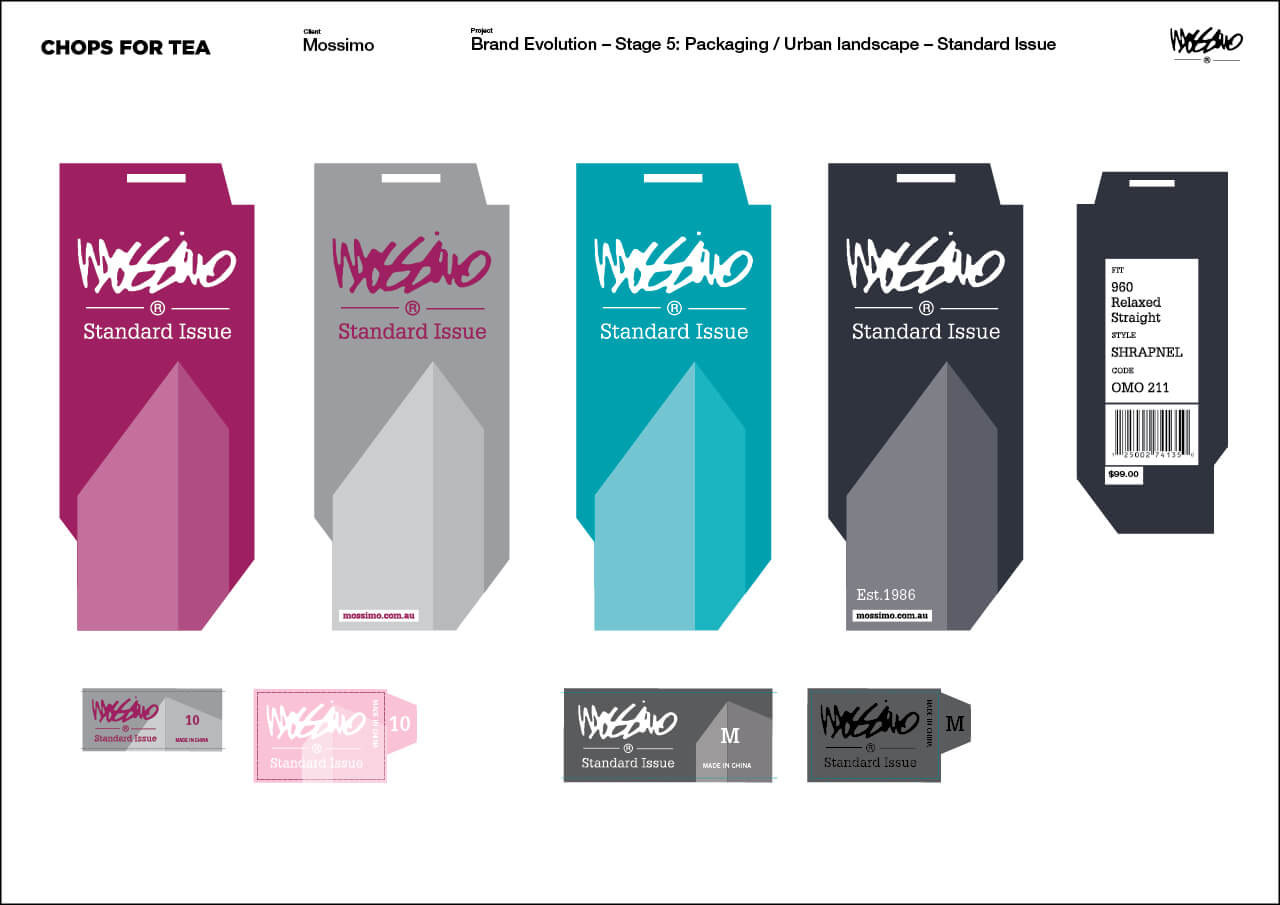
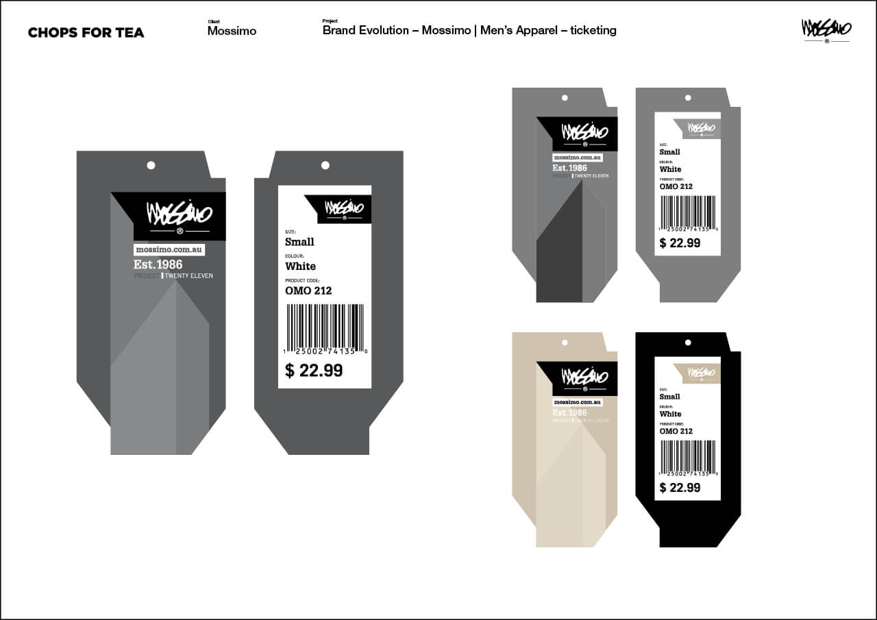
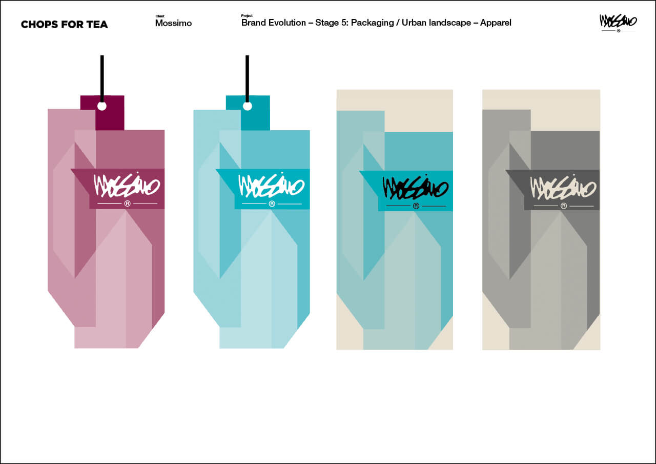
We then created a packaging system that segmented the Apparel, Denim, Underwear, Accessories and Youth categories with gender specific colours, creating clear distinctions between product areas instore, giving over 150 product label and packaging elements a consistent look and feel. Finally, we provided extensive guidelines on how the new branding and packaging should work.
![]()
Deliverables
+ Extensive research & interviews
+ Mossimo logo application evolution ‘speech bubble’
+ Application to entire product range
+ Creation of extensive brand & labelling guidelines

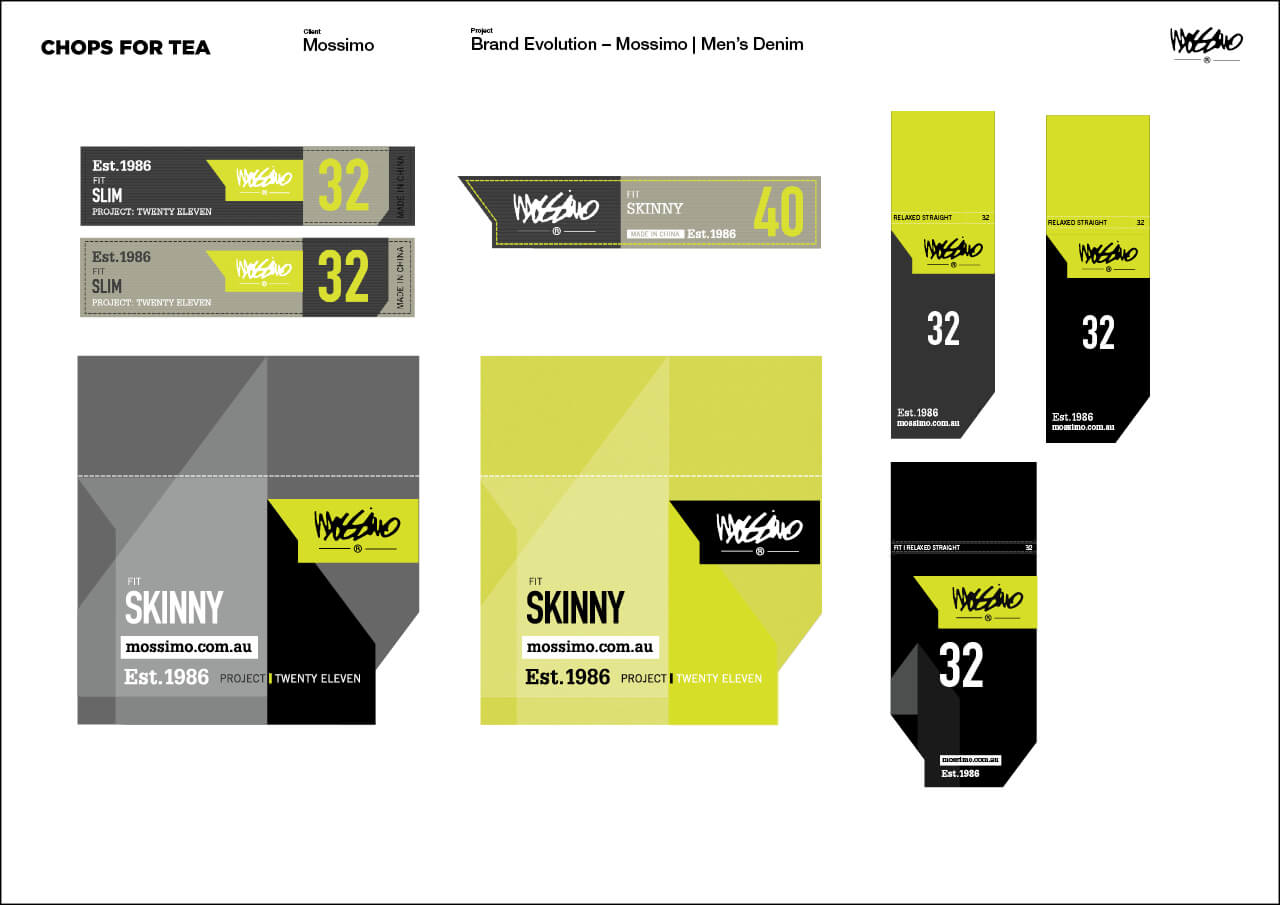
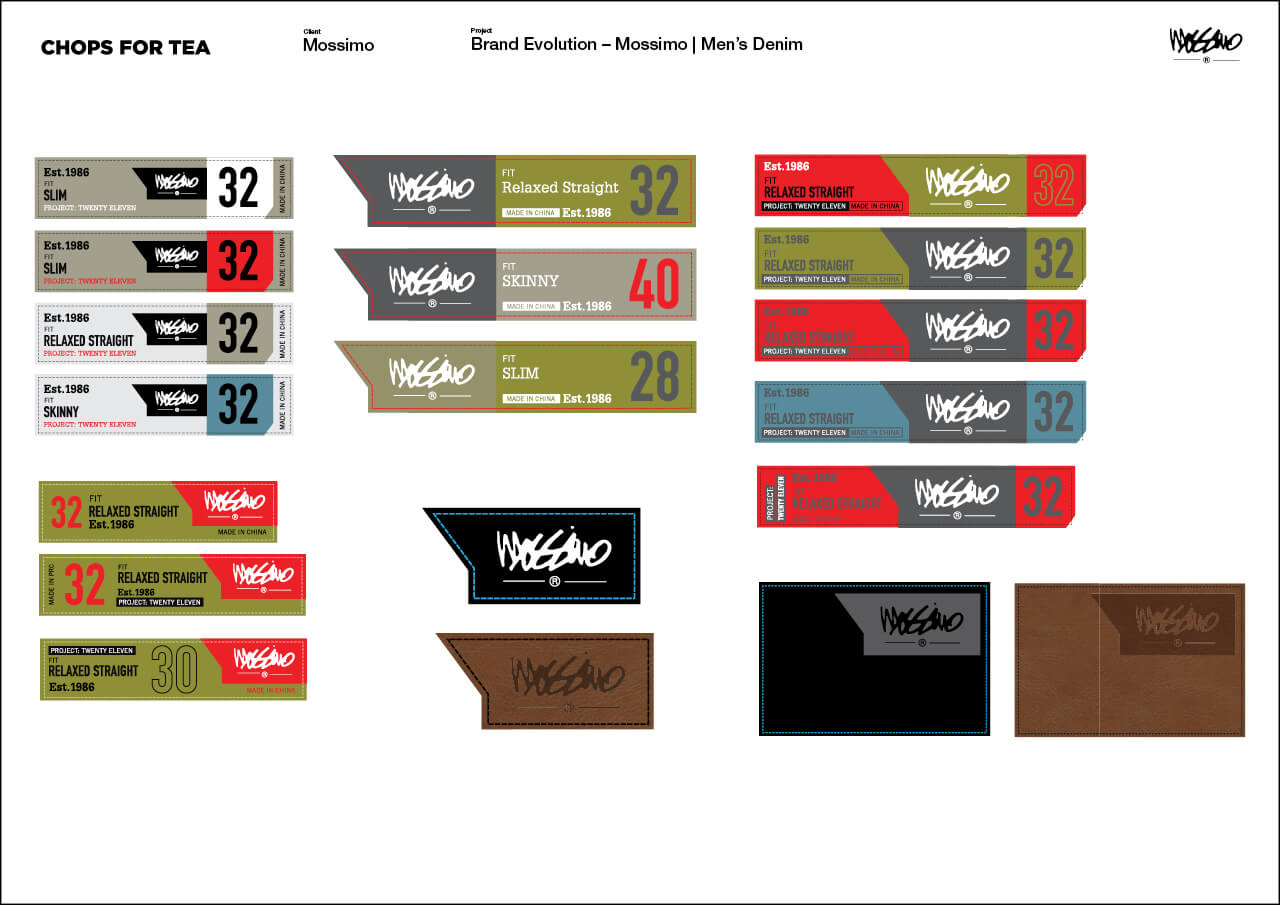
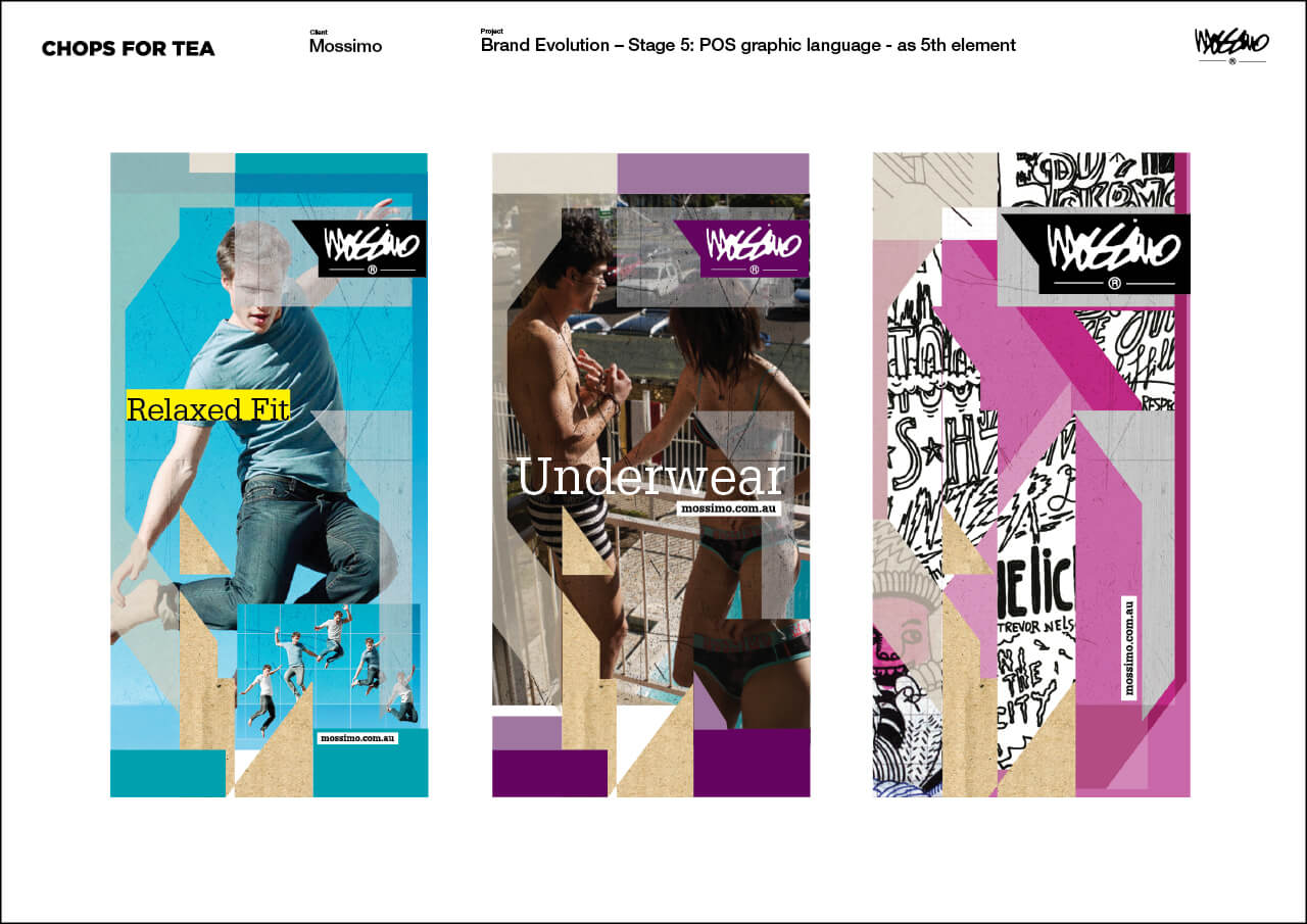
Mossimo Denim Packaging
Almost a project within project. Mossimo’s denim range is extensive
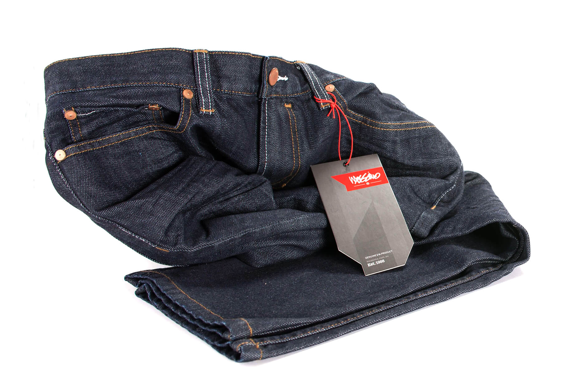
A tight colour palette helps to identify key product segments.
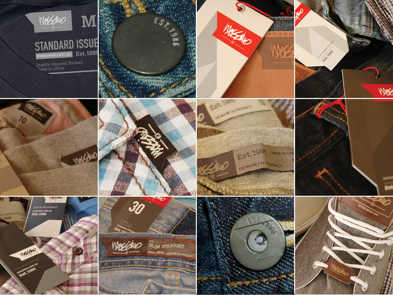
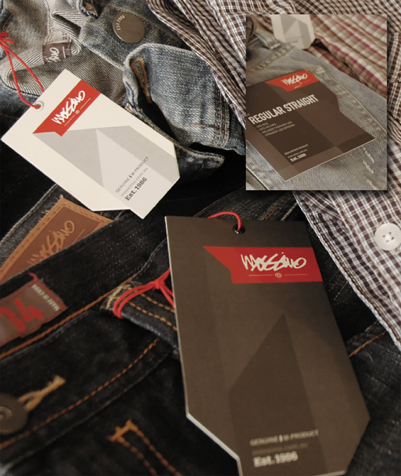
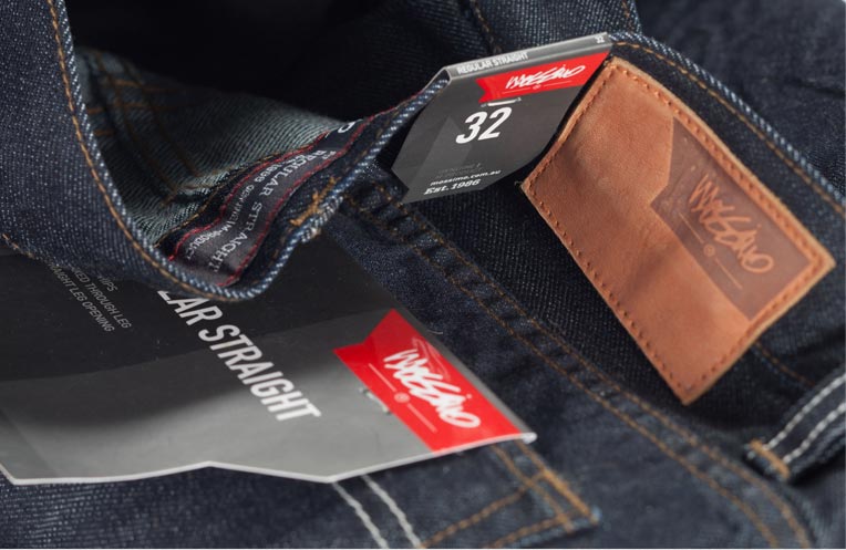
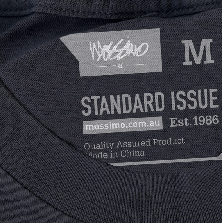
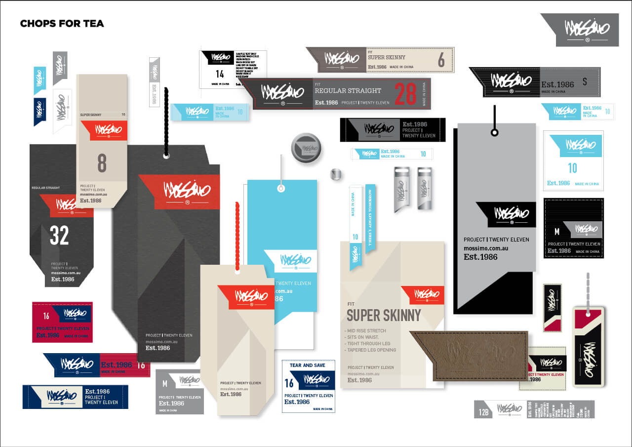
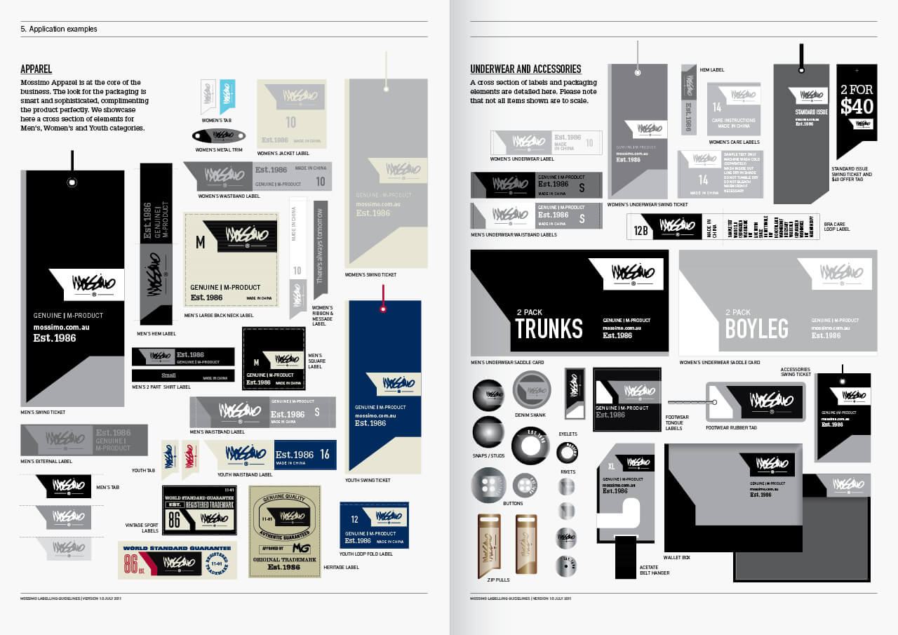
Selected labelling & packaging elements across multiple product categories
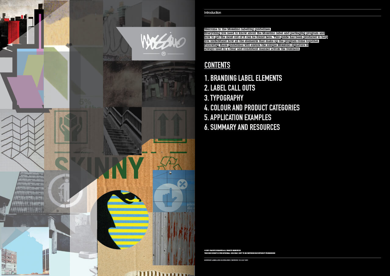
Extensive brand guidelines document the brand personality & positioning through visual clues as well as written content. This document also serves to catalogue the extensive labelling & packaging range.
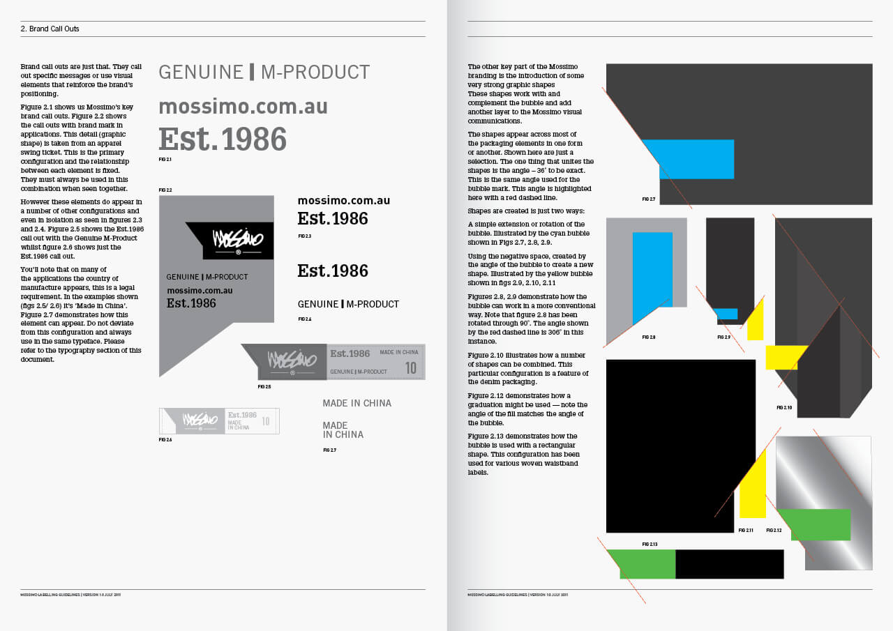
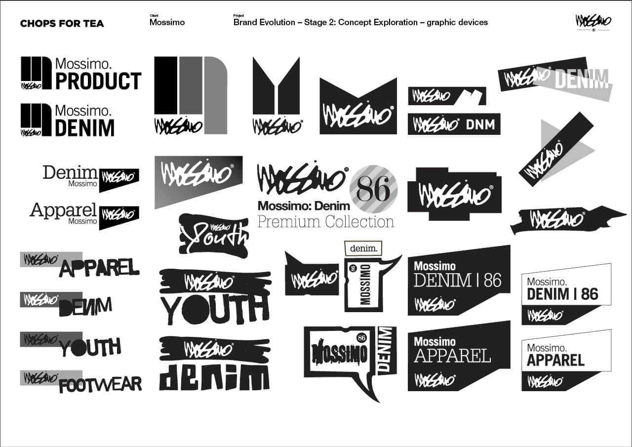
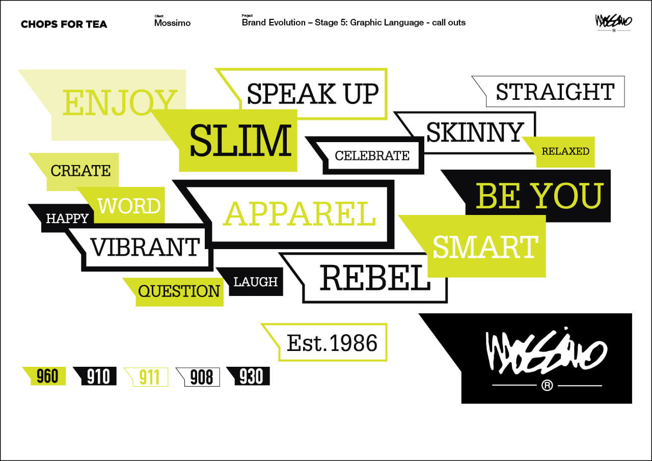
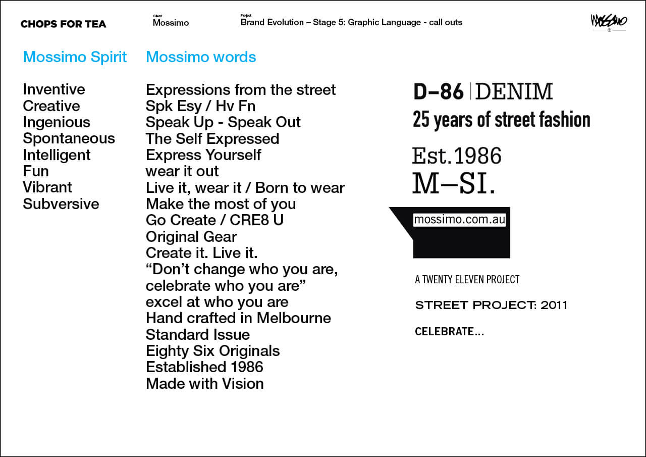
We developed some key brand call outs.
Pages from the brand guidelines illustrate how the graphic language around the Mossimo ‘bubble’ can be used.
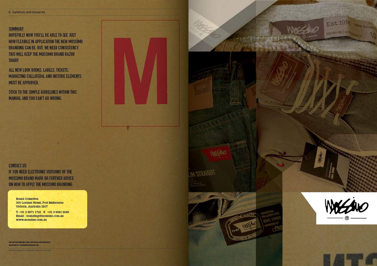
How to develop a brand without changing a cherished and recognised identity.
This was always going to be the challenge.
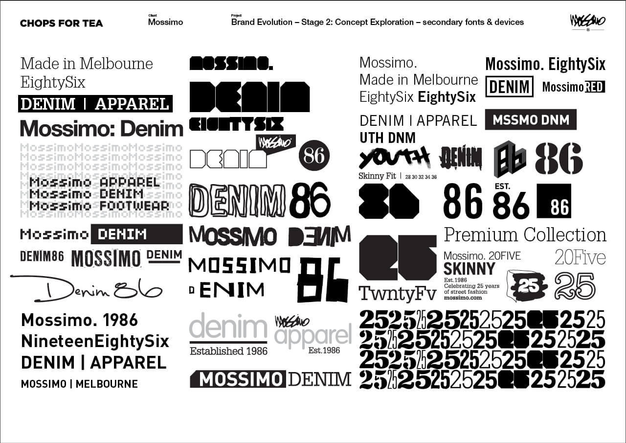
Here we show highlights of concept boards, charting our thinking and the design process. From initial concepts based on our research through the development phase and then into final application.
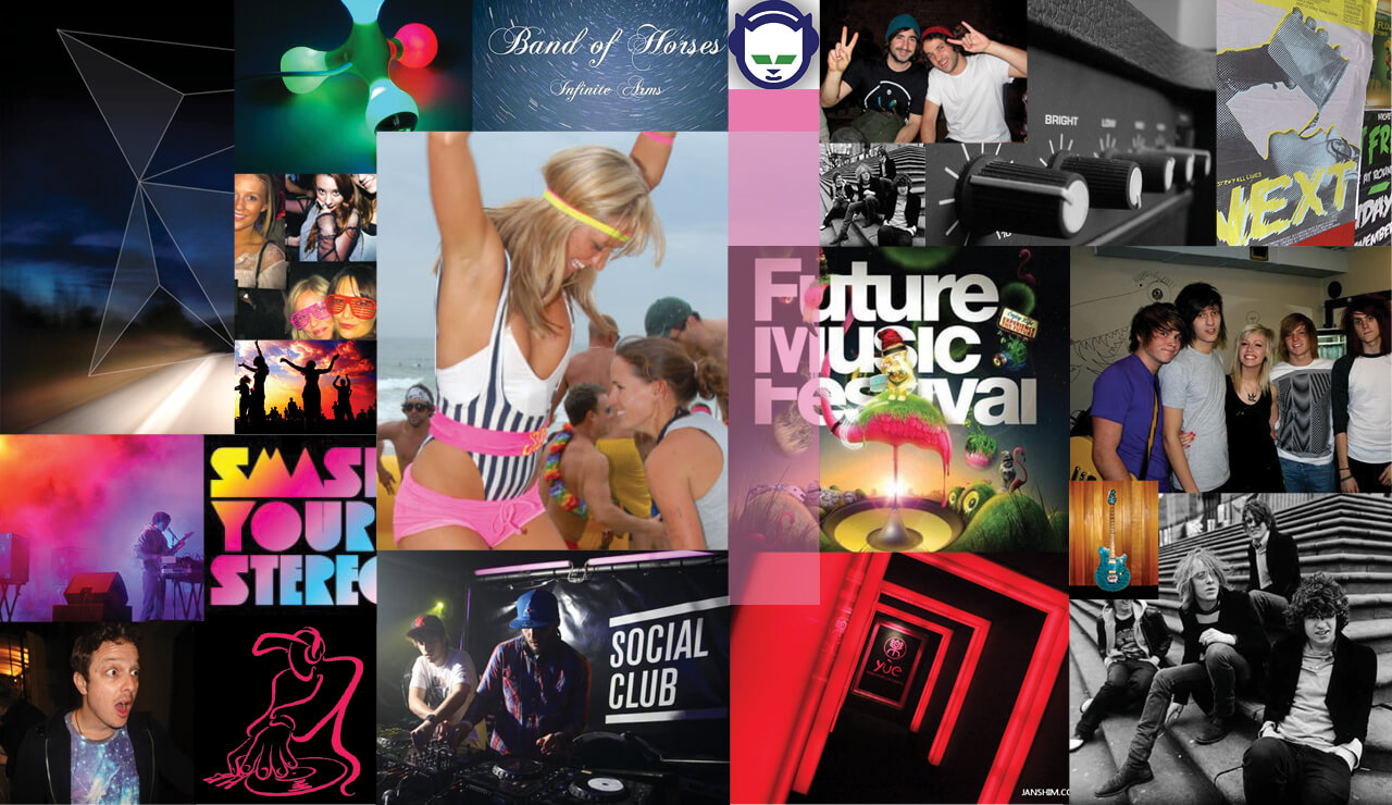
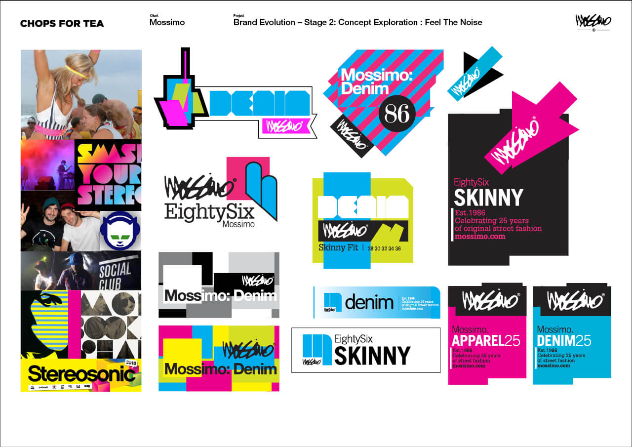 Concept Development — Feel The Noise
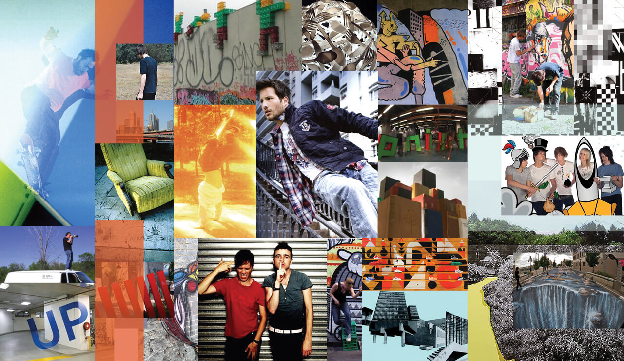
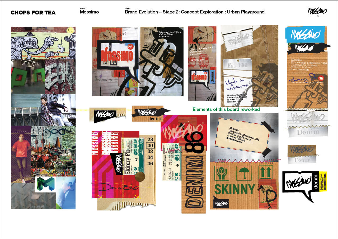 Concept Development — Urban Playground
From our stage 2 concepts 3 main directions emerged that merited further design exploration.
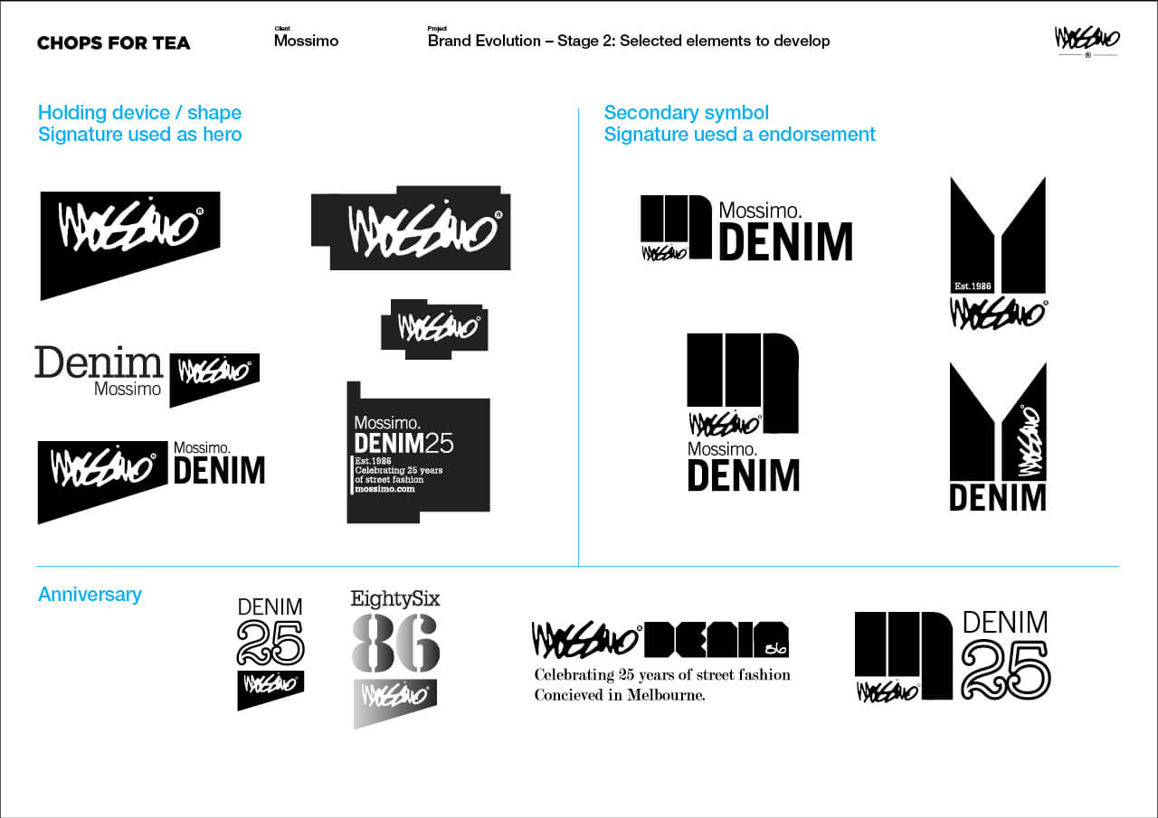
Developing the concepts.
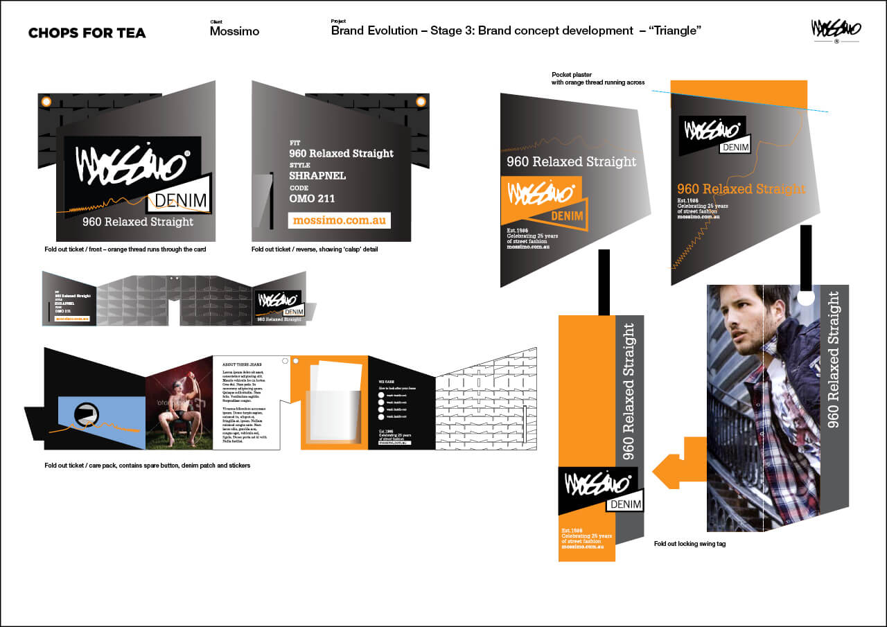
We called our 3 directions, Construct, Factory & Foxy — the explored the urban playground vernacular.
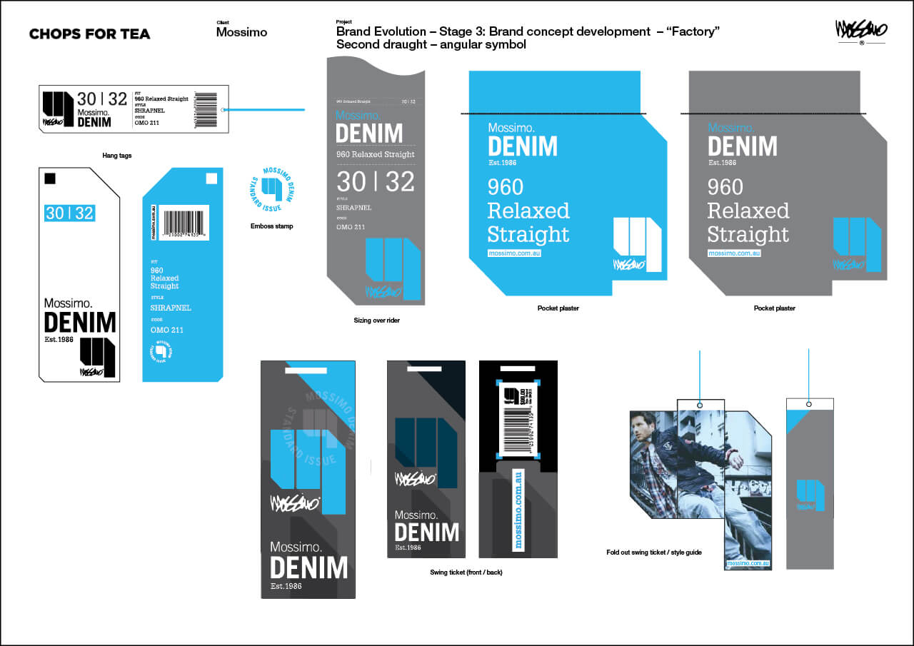
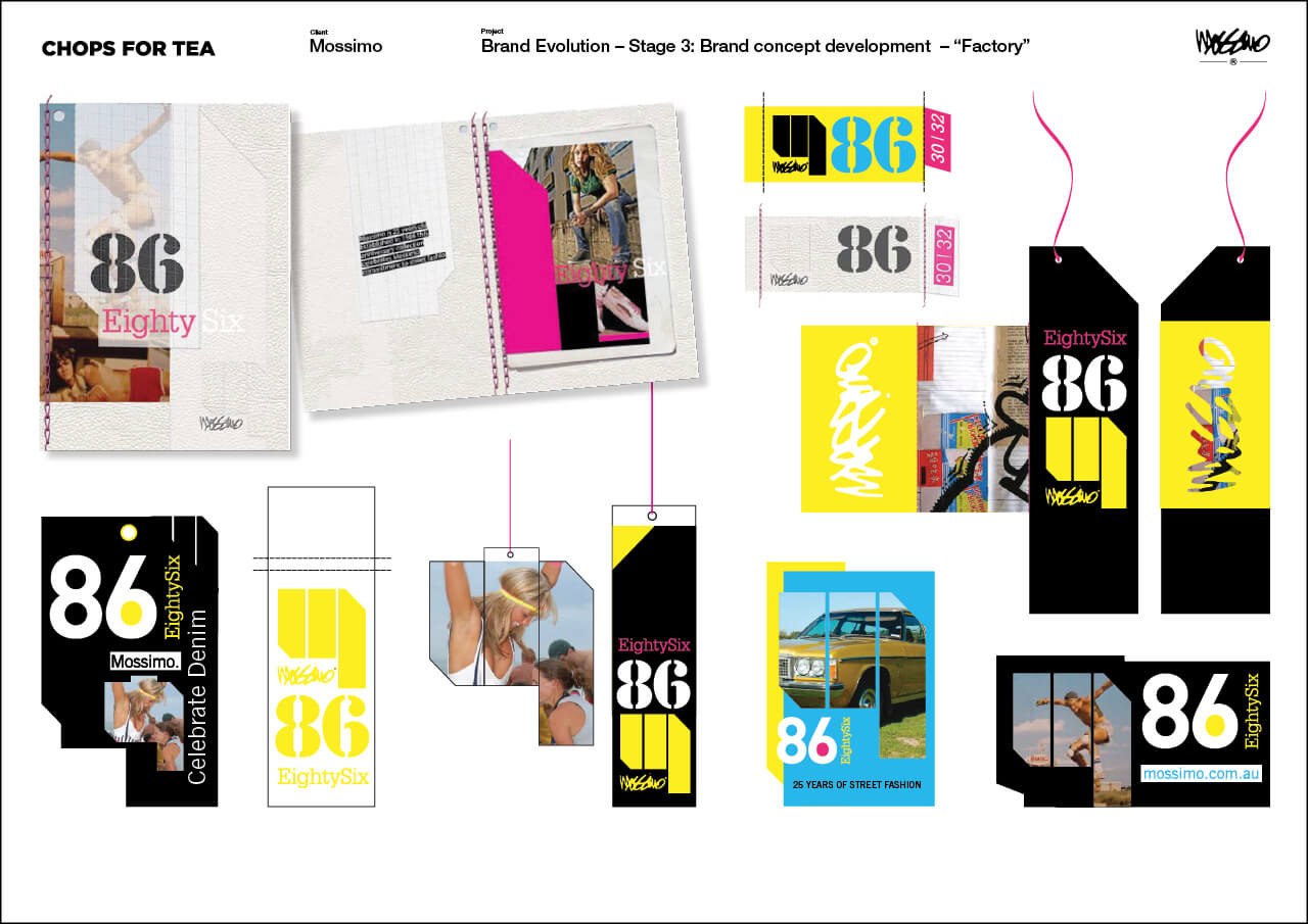
Factory
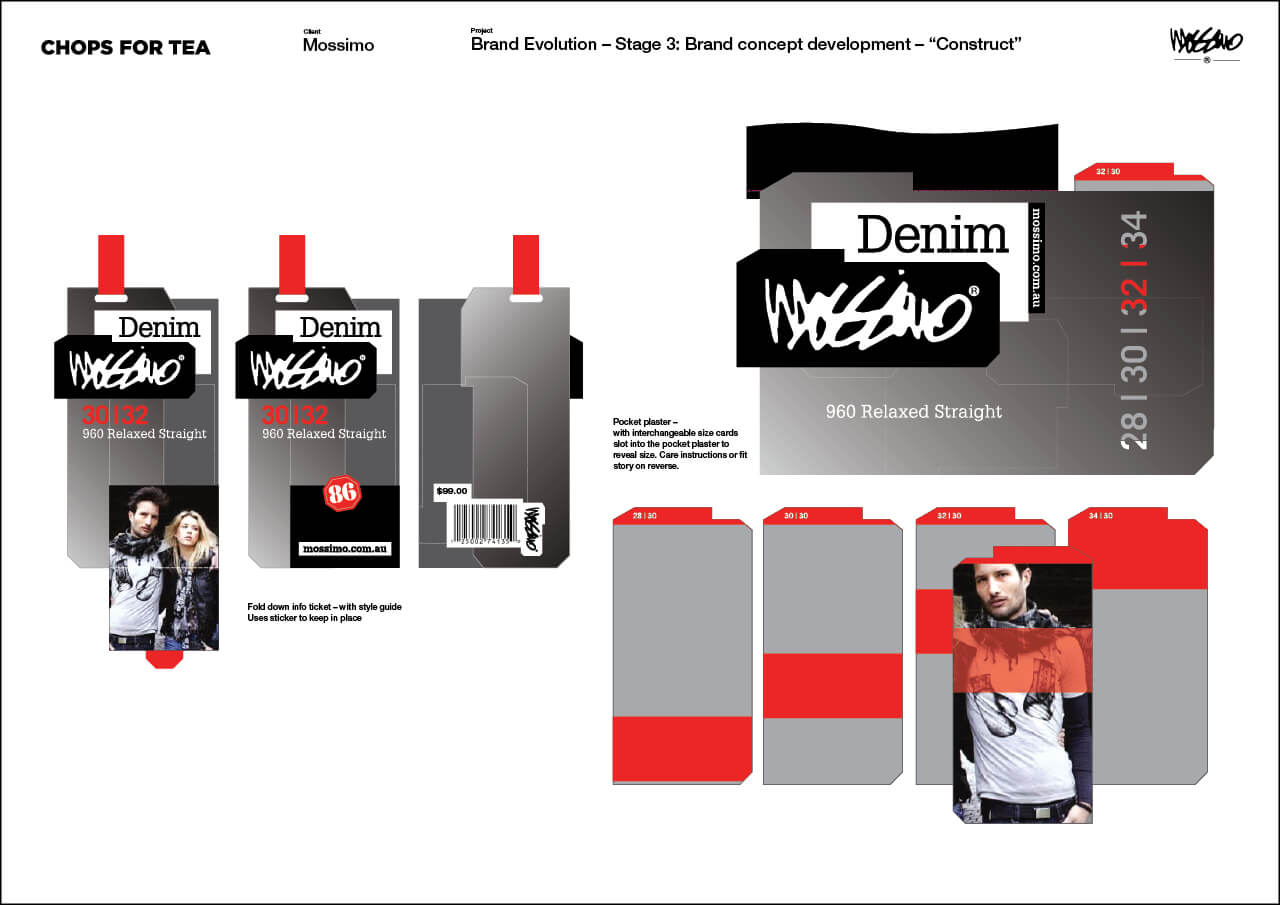
Construct
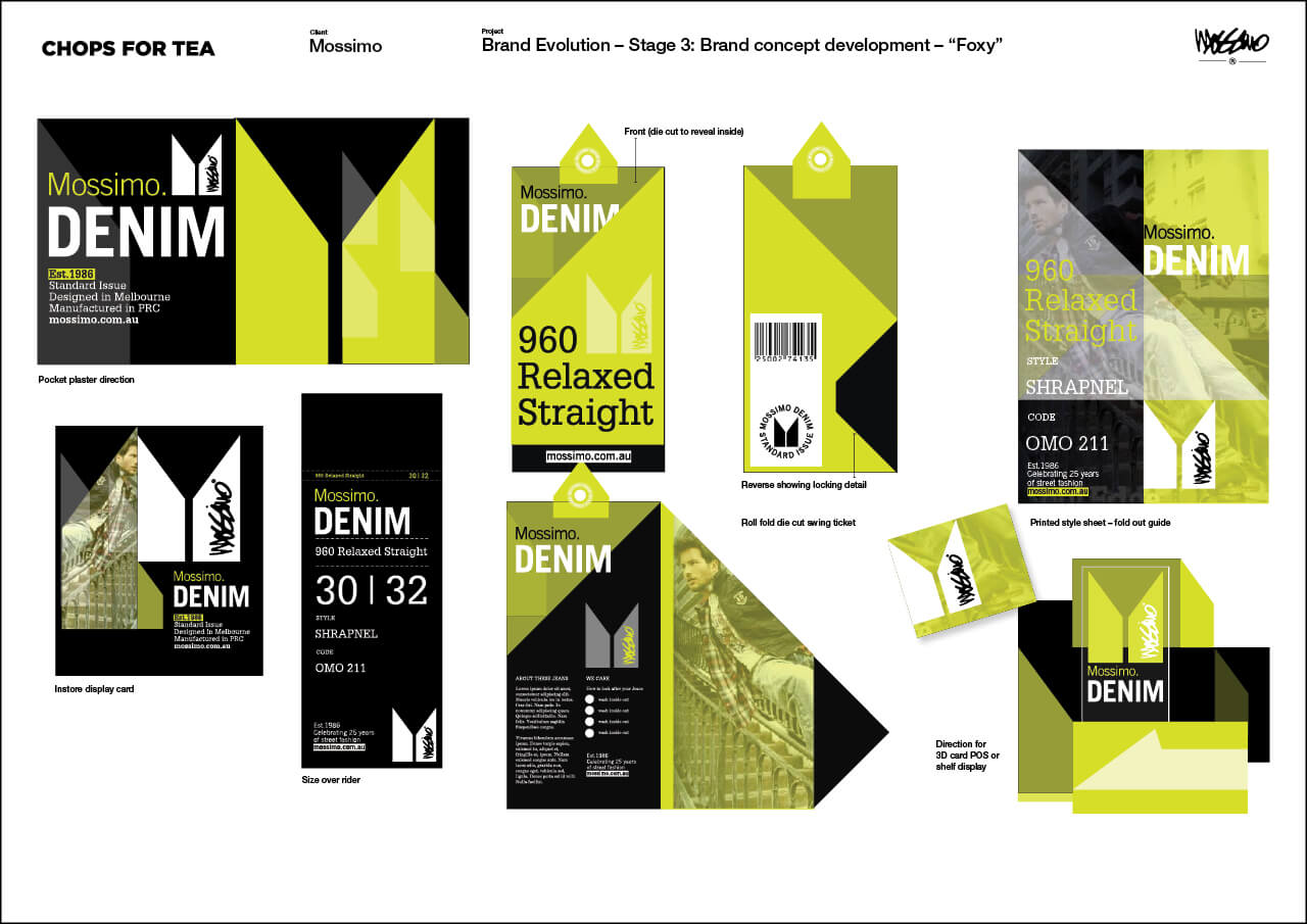
Foxy — playing with graphic shapes, folding card and packaging elements
Refining the design.
The Mossimo team loved ‘Foxy’. It was the direction that stood out. They loved the shapes and this prompted us to look back on our concept work. Developing call outs and so the “word on the street” came to be. With this in mind we set about refining and testing other possibilities based on this aesthetic. We also explored colour palettes which need to be more subtle…
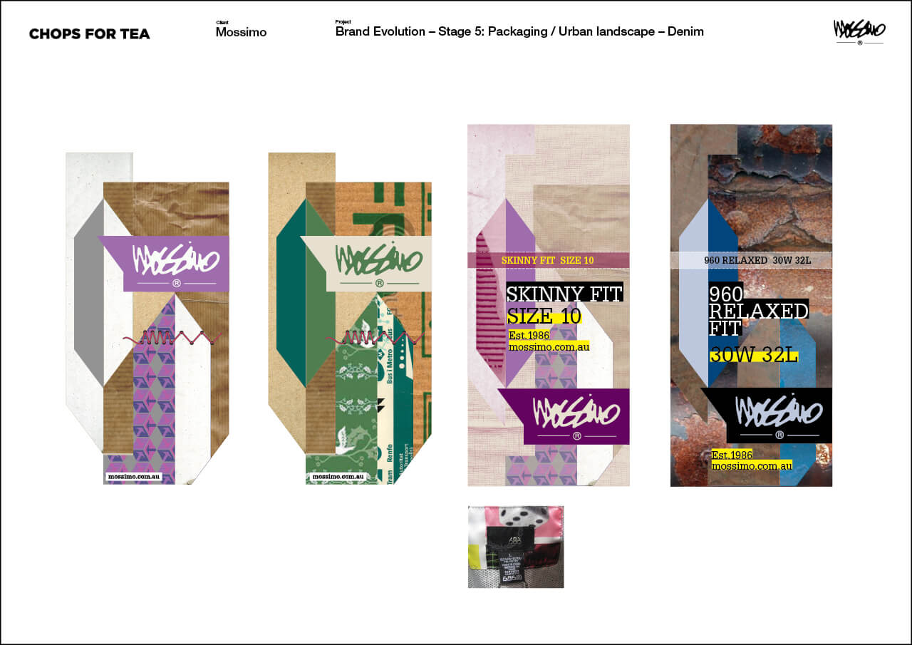
Happy distractions — pushing the concept.
Part of what we do is be creative. And once you have an idea sometimes, if time and budget allows, it’s good to push ideas and see where they land. The idea of using recycled materials from the ‘urban playground’ was welcomed… the concepts are fun and challenging. Ultimately a more conservative approach was taken to the packaging.
Creating the system, simplifying the shapes.
It’s super important to push projects and explore possibilities. All worthwhile projects deserve this respect and we like to bring this to the table. However, at times commercial reality kicks in and when you’re a high street retailer, in a fiercely competitive sector, every cent counts. And this instance we needed to ensure the packaging costs came in on budget. This meant we said good bye to our up-cycled look and adopted the smarter (and less expensive) but more conventional approach across the packaging.